To revert to the previous design of Google Chrome on Windows 11, you can go to Chrome://flags and disable four specific flags: Chrome Refresh 2023, Chrome WebUI Refresh 2023, Chrome Refresh 2023 New Tab Button, and Chrome Refresh 2023 Top Chrome Font Style. After completing this process, relaunch the browser to bring back the old appearance.
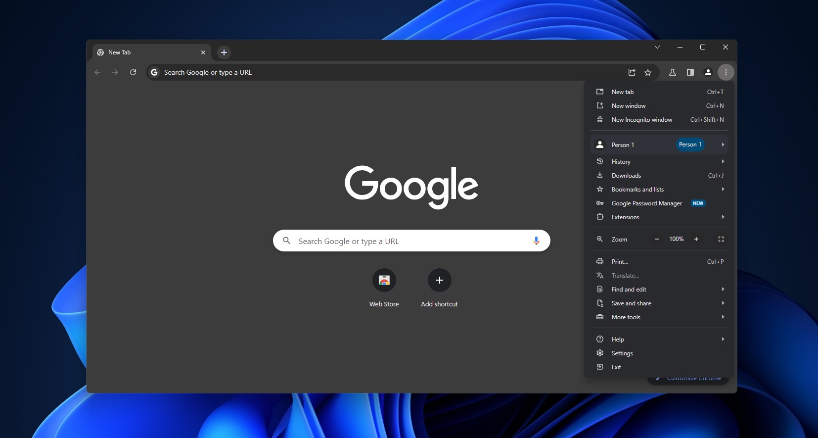
Google’s updated design, which was initially discovered in the canary branch, is now being introduced to some users in the stable channel. Following the app update, you will notice that the address bar, menu, and icons have rounded corners instead of the previous square or straightforward design. This new redesign is officially called “Chrome 2023 refresh.”
So, what exactly is changing with this update from Google? Our testing has shown that Chrome now includes more vibrant icons, increased spacing between buttons or text, rounded corners, and a touch-first interface. This means that the main menu, right-click context menu, and other components now take up more space.
If you are unhappy with Chrome’s new look, you can revert to the previous design by following these steps on Windows 11: Open the Chrome flags menu by typing chrome://flags in the address bar. This menu allows you to enable or disable features in the browser, including the 2023 refresh. In the Chrome://flags menu, search for “refresh 2023.” You will find four flags with the title “Refresh 2023” in the default state. Disable all four flags by selecting “Default” and toggling to “Disabled.” After completing this process, relaunch the browser to return to the old version of Chrome. You can always return to the Chrome 2023 refresh by resetting the flags to their default state.
Taking a closer look at Chrome’s 2023 refresh, it has received mixed reviews. While some users appreciate it, others are not fans of its more tablet-friendly approach. The most noticeable change in the Chrome 2023 refresh is the pervasive use of rounded corners. Menus, right-click contexts, and other areas now feature rounded edges and colorful icons. Additionally, the address bar, link previews, and other elements have softer edges. Google seems to be implementing its Material design principles, as evidenced by the increased use of shadows in the right-click context menu. The rounded corners and increased spacing between elements likely aim to better support touch-screen devices. Another notable change is the addition of a new tab card feature that allows users to view memory usage by hovering over active tabs.

Leave a Reply